Hotel Vinci Due is located in the 7th arrondissement of Paris. This building, adjacent to the Caisse des Dépôts et Consignations, was constructed in the 18th century. It now offers 15 rooms inspired by Italian Renaissance, as well as a private spa with a pool. Mis en Demeure was chosen as the interior decorator to enhance the lobby and bar of this 4-star hotel. Discover more about our creative approach and the renovation process. We present our work through images and highlight the most striking decorative details.
The implementation of the renovation project
The building housing the hotel was entirely renovated, with great skill, by architect Bruno Le Steun. In close collaboration with him, we had to adhere to certain surface constraints that posed a challenge.
The challenge? To design a decor while respecting the main constraint: a limited space of 70 m², which includes the public entrance, breakfast room, stair accesses, the spa, the elevator, a small office, the luggage room, and the waste disposal room.
So, how to highlight elements from the era of construction and effectively showcase them? How to restore the hotel to its deserved splendor and justify its 4-star rating?
Our approach involved focusing on several points. First, preserving and highlighting traces from the construction era. Second, finding solutions to showcase these elements without causing visual clutter. Finally, enhancing the space with strong elements and meticulously chosen details.
The hotel's entrance highlighted
The hotel's entrance is a crucial space as it provides visitors with their first impression of the premises. The decor must be refined and project the best image of Hotel Vinci Due.
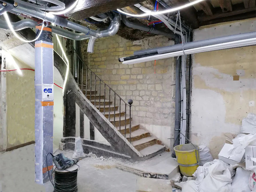
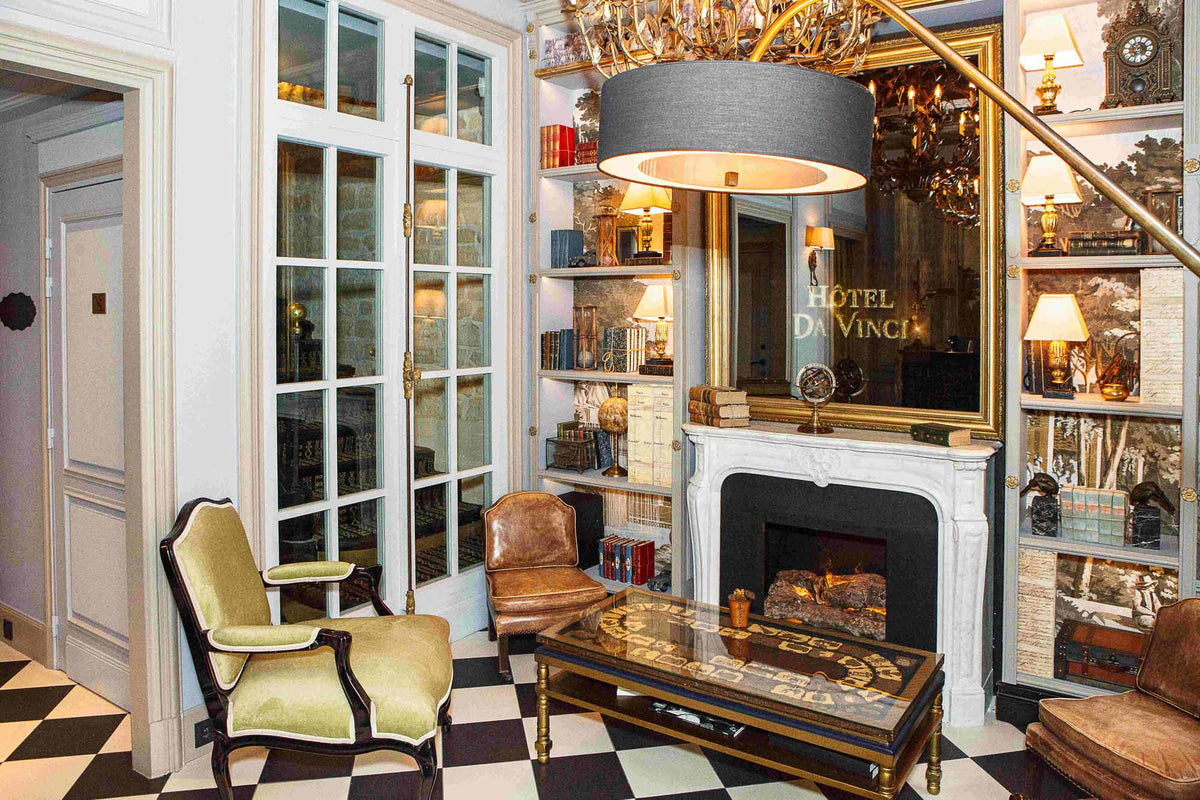
The photographs speak for themselves; the transformation is striking. The space has been completely reinvented in line with the architect’s requests, creating new volumes.
Conservation of original elements dating from the hotel's construction
The search for significant traces from the building's construction allowed us to highlight original elements that are essential and tell a story.
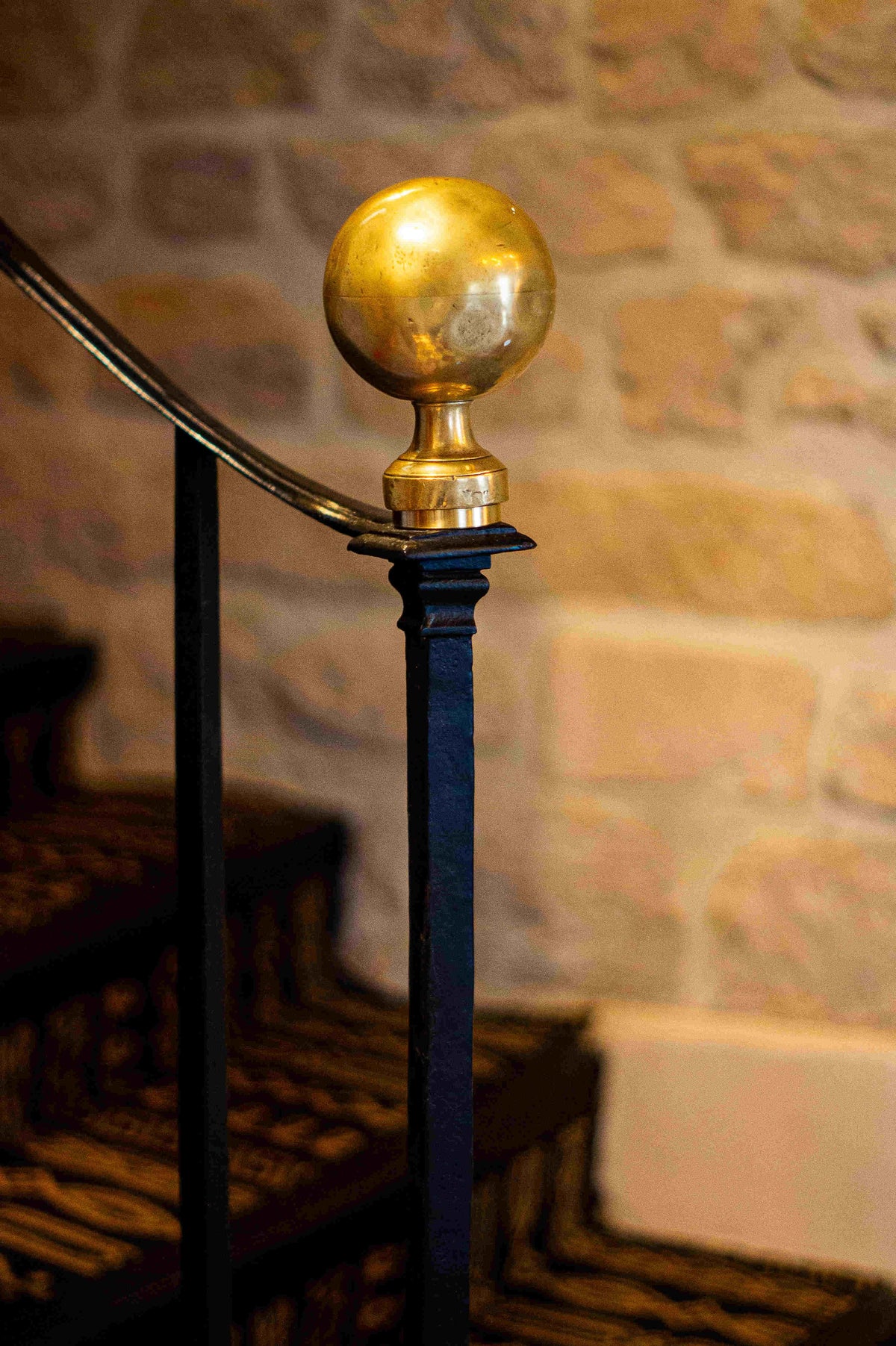
Thus, we preserved the building's staircase and its wrought iron railing, which was stripped down. We adorned its starting post with an antique gilded sphere. In the photograph, you can also see a section of the original stone wall that adds character to the staircase. To separate this part of the hotel and create new volumes, we chose to add a French door with its original hardware, featuring gilded details.
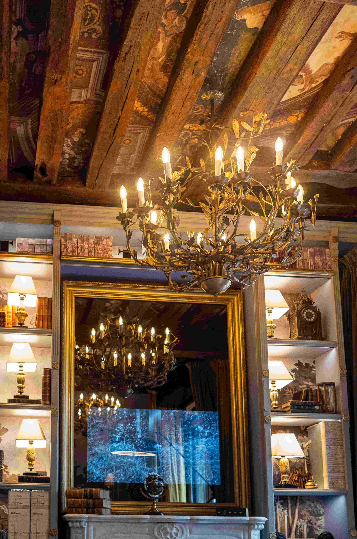
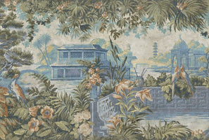
This is not the only element of the building that was preserved; the ceiling still had its old wooden beams as a trace of the past. To enhance their value, we interspersed them with wallpaper featuring an 18th-century design.
The selection of furniture and decorative accessories
Once the space was envisioned, we focused on the decor to create a true "universe." We wanted a warm, inviting room that encourages relaxation and comfort, inspired by the hotel's theme.
To achieve this atmosphere, we placed our Brienne armchairs, upholstered in pale green velvet that adds a touch of color. The Elysée Maintenon chandeliers, gilded with gold leaf, provide a very soft light that enhances the decorative elements.
Above the marble fireplace, we placed an antique mirror that further enlarges the room. The surrounding library was custom-made in our workshops, incorporating antique elements.
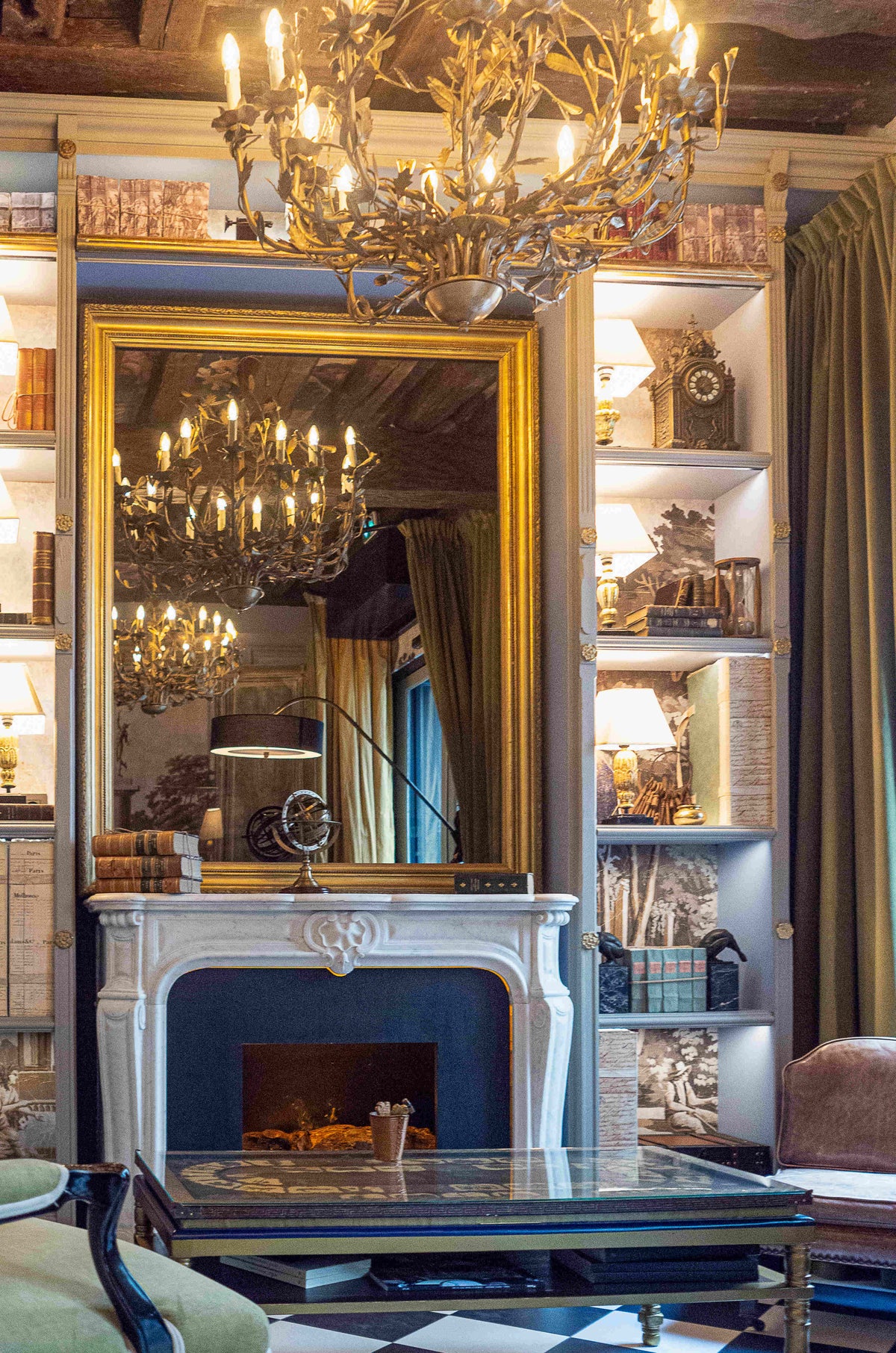
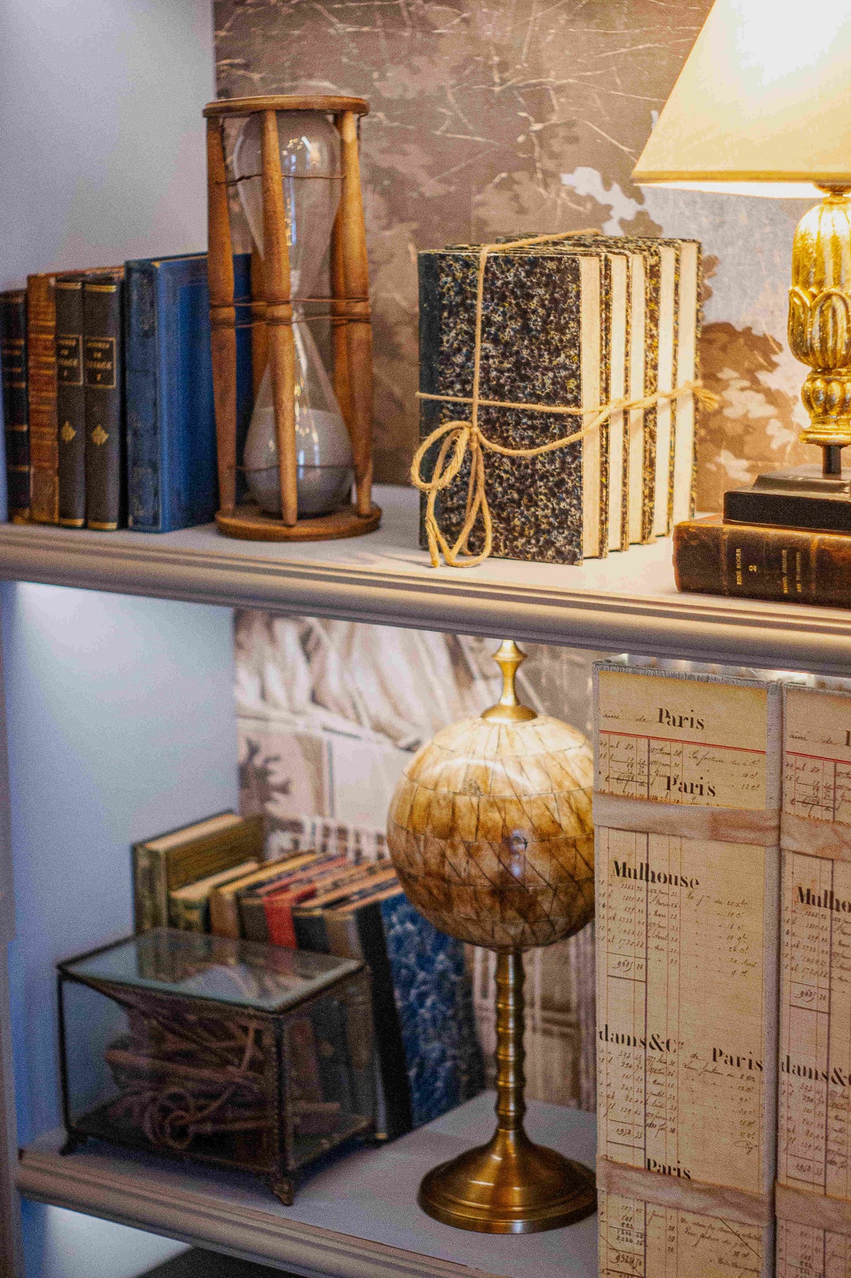
Among the decorative accessories, we have an armillary sphere, a table clock, bedside lamps illuminating the library, a vintage suitcase, authentic hourglasses, and beautiful pieces like an unusual bookend. In addition to making a difference, they reinforce the unity of the room.
The transformation of the breakfast room
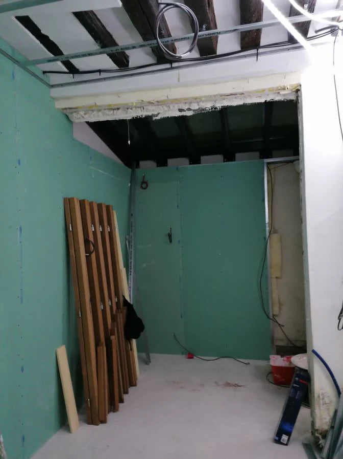
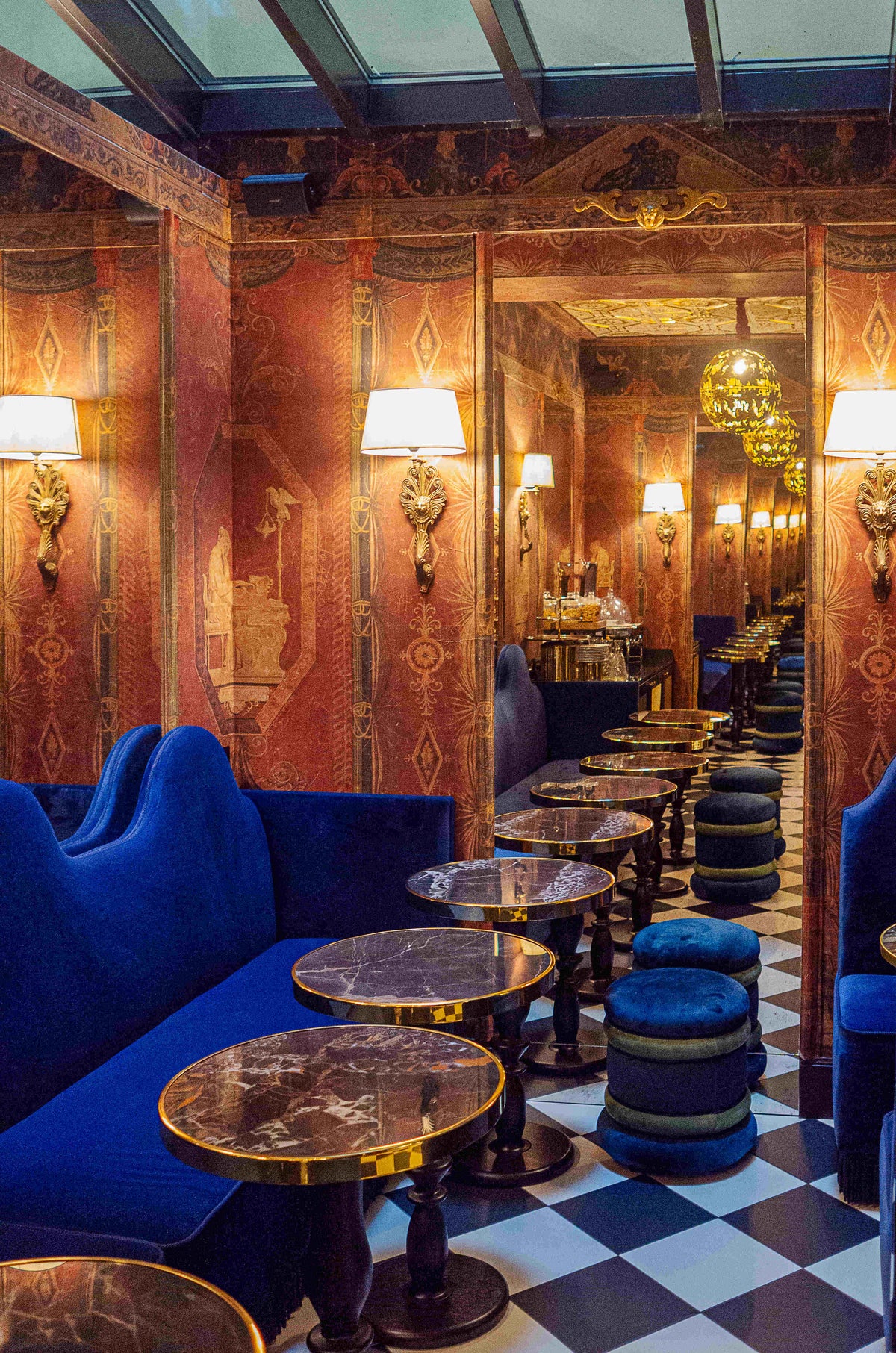
Another remarkable transformation is the breakfast room, which has undergone a complete makeover. The biggest challenge? Expanding the space to avoid a cramped feeling while charmingly reflecting the unique character of the place.
Transforming spaces with a few tips
To add more depth to the breakfast room, we used a few tricks to play with the volumes.
First, we installed tall mirrors. They are framed and highlighted by wallpaper with a Pompeian design, specially created by Mis en Demeure from antique drawings for the Vinci Due Hotel.
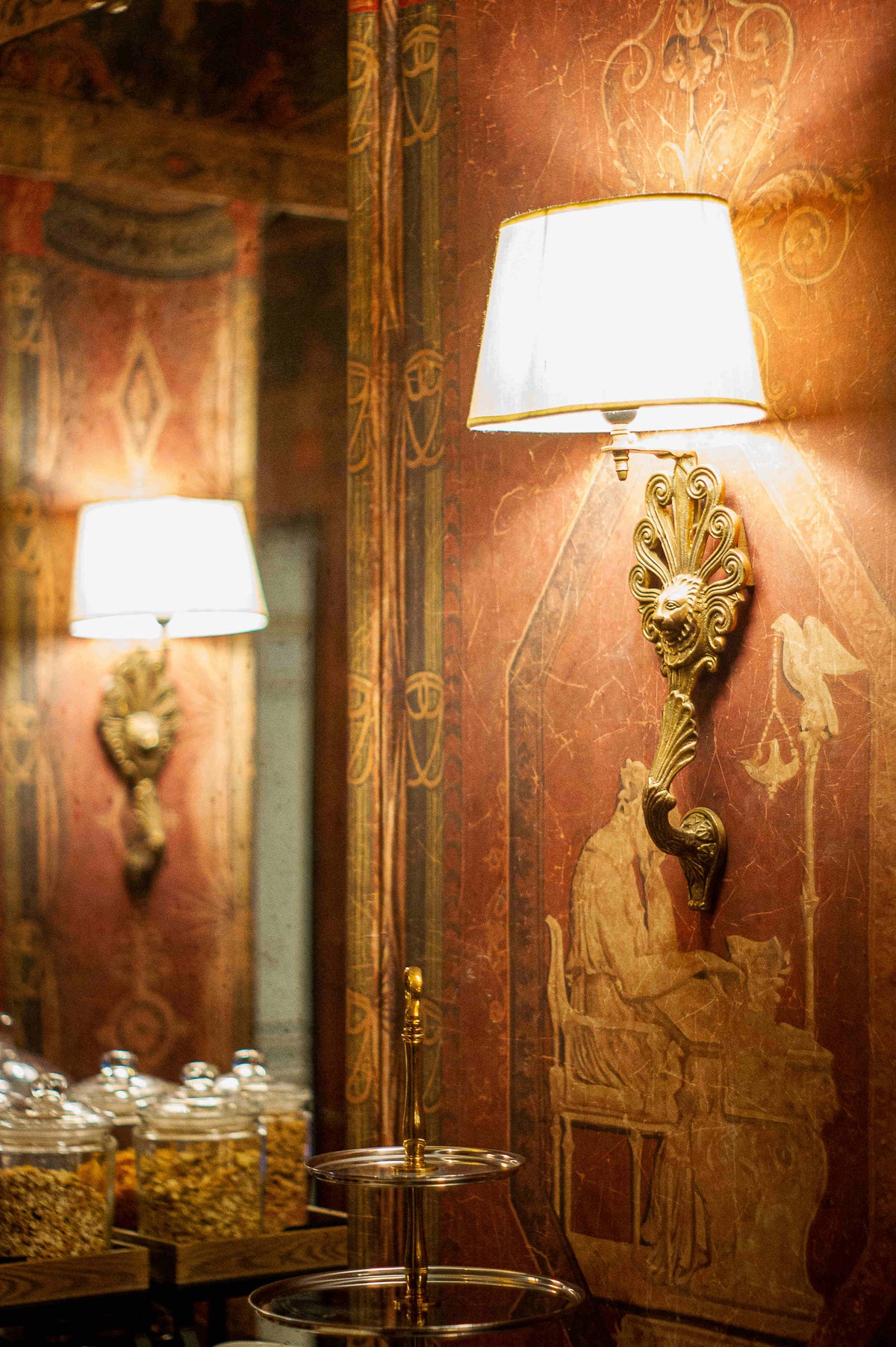
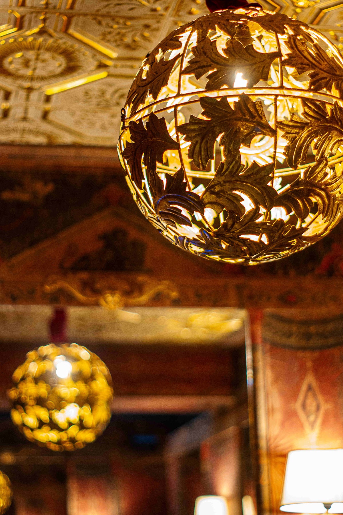
The lighting adds a warm touch, essential for this space. We chose two key elements to enhance it:
- Gold lion-head wall sconces along the length of the wall.
- The Artemis lantern, decorated with gold leaf.
To play with perspective, we installed a floor with a strong visual impact. Its unique patterns create the illusion of a much longer room
The choice of elegant and high-quality furniture
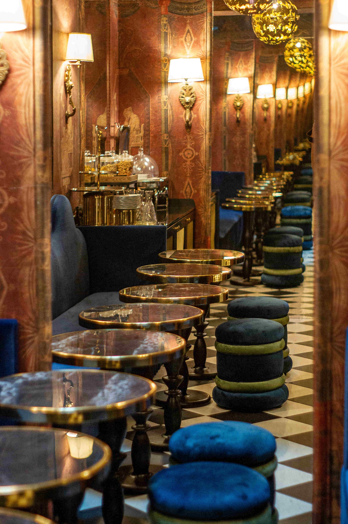
All the elegance of this room lies in its decorative details and the care taken in selecting the furniture.
For a better dining experience and to match the hotel's ambiance, we opted for chic bar tables and comfortable velvet seating. Against the wall, blue banquettes invite relaxation and contemplation of the space, while bespoke poufs complete the seating arrangements.


